There is no other way to represent the sphere that is the Earth than to project it on a flat sheet. Actually it’s not even a sphere but a geoid, a sort of lumpy thing like a potato, higher in some places and sunken in others. And it is not easy to put a complex shape like the Earth’s onto a plane.
This is the earth geoid:
One of the best illustrations ever to illustrate the concept of the world map – and the distortions that every map attempting to transfer a 3D figure onto a 2D plane encounters – comes from a book published early in the last century, “Elements of map projection with applications to map and chart construction” written in 1921 by Charles H. Deetz (born in 1864) and Oscar S. Adams (born 1874).

The figure at the top left shows a head drawn on a globular projection, while the other three figures show the same drawing on a planar orthographic, stereographic and Mercator projection. What happens to the drawing is the same thing that happens to the features of Earth when they are drawn onto a flat surface. This does not mean that the globular projection is better than the others: any transition from one projection to another implies a distortion.
Preserving the shape and size of the continents in 2D is not a simple thing, and it is the main problem of the most well-known map of all, the one using the Mercator projection, named after its inventor, Gerardus Mercator (1512-1594) – a Flemish cartographer

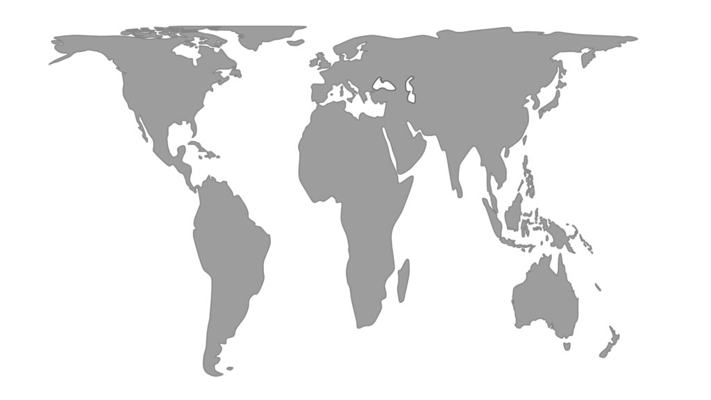
The Earth on a Mercator projection from “Elements of map projection with applications to map and chart construction” by Charles H. Deetz e Oscar S. Adams
Before destroying the reputation of Mercator, let’s specify one important thing: there is no projection that can accurately return the Earth in all its parameters. All projections in 2D can maintain only one parameter between angle, area or distance, which translates into an accuracy scale for each projection. If you want to know which are the most accurate maps (spoilers: there are dozens of them) I suggest you this cool site. If instead you are an obsessive-compulsive pro, and you want an accurate comparison of all and nothing but ALL the existing maps of the globe I suggest you stock up on Christmas pudding and spend the holiday season on this site.
As we said, each projection can preserve the accuracy in only one parameter. The Mercator projection preserves the angle between longitude and latitude, which always remains at 90 degrees (maps that preserve angles are called conforming). Since lines of longitude are parallel to the equator, but definitely not parallel to the poles (from where they radiate), maps using the Mercator projection system inflate the poles and expand the continents that are further away from the equator: the east to west scale on a Mercator map changes with distance from the equator. This means that to all intents and purposes the world as we map it is distorted. Africa is the second largest continent by area after Asia, but Mercator’s Africa looks smaller than North America, Mercator’s diminutive Australia is much bigger than Europe, the Scandinavian regions in reality are very small and Mercator’s Greenland is not as big as South America. If you want to play the game of discovering the true size of each country, go to this very well-made interactive website.
There are a lot of debates as to whether Mercator’s maps were somehow colonialist, and intended to belittle equatorial nations with a specific socio-political intent. My one euro opinion on the matter is: yes and no. Yes, because the maps were made by nations that had, among other things, grand colonial intentions. No, because Mercator was a cartographer who made maps for navigation, which in 1569 was the equivalent of today’s air transport, that is, the fastest way to transport goods and people from A to B. In order to navigate you need to maintain a route, and nothing keeps it better than straight lines. That’s why the Mercator projection was created, and this is why those nations that at the time used maps adopted a system that was adapted to the needs of navigation, rather than those of geographical correctness. Africa is bigger and South America is further away, but what they cared about was getting there, rather than knowing when they would arrive – they were, after all, at the mercy of the wind for their ETA.
Other maps have been proposed over the years, the most well-known alternative to Mercator is perhaps the Gall-Peters projection, which is a projection that preserves the area, but not the distances and angles. In the maps that use the Gall-Peters system we can finally gauge the true size of continents. This version of the globe is the one that comes closest to show that the lands in the south are twice the size of those in the north. Although it respects the areas, the projection of Gall-Peters also has its deformations. Where Mercator inflates at the poles, Gall-Peters stretches at the equator. If you want to compare the two maps here is a clear picture of the differences between them.
Whatever map you choose, the important thing is to keep in mind that none of them represents the globe perfectly, that Mercator’s map is wrong for the areas, and that Google Map should provide more options, like this one for example: the icosahedron Dymaxion map, built to preserve both areas and distances and devised by Buckminster Fuller. Not particularly practical because the best way to view it is on a cuboctahedron, but still rather fascinating because its 2D version can be assembled in the shape of a spaceship. It preserves the shapes rather better, because when it’s folded back up from the flat version, it’s not too far off being a sphere – but not so easy to measure the distance from Cape Town to Rio de Janeiro on the flat version.
Xkcd – Tell me which map you choose and I will tell you who you are! | One of the most nerd comic strips of all time offers us its perspective on the world of cartography, confirming that map rhymes with mathematics.
Time Bandits | Terry Gilliam’s 1981 fantasy, seen through the eyes of 11-year old Kevin, rudely awakened from his suburban bedroom by six renegade dwarves, on the run from the Supreme Being, using a stolen map showing rips in the fabric of space-time to steal untold wealth. Kevin and the six embark on a series of typically Gilliamesque adventures including encounters with Napoleon, Robin Hood, Agamemnon (RIP Sean Connery) and the Titanic. Mad-cap and brilliant…..and loosely related to a map. Best line – “If I were creating the world I wouldn’t mess about with butterflies and daffodils. I would have started with lasers, eight o’clock, Day One!” Evil Genius…..who else!
![]() This article appeared for the first time on our fortnightly newsletter. To keep up with the scientific debate, join the community of Monnalisa Bytes and to receive a preview of all our newsletters subscribe here!
This article appeared for the first time on our fortnightly newsletter. To keep up with the scientific debate, join the community of Monnalisa Bytes and to receive a preview of all our newsletters subscribe here!
